
Byte Feature Design
CREATIVITY FIRST
background
In its current state, (February 2020), Byte is simple, condensed, and nostalgic. In order to attract content creaters and consumers in a highly competitive social media landscape, Byte needs a rollout plan with just enough features to make the app more useful and remain novel.
Scope
UX Research
UI Design
Visual Design
Industry
Entertainment
Social Media
TEAM + Role
Kylie Hirt & Sam Haraway
(a true team effort— Kylie, Sam and I contributed to each part of the UX process, but Sam did a majority of research synthesis thanks to his academic research background, I created our design system, journey map template, and Hannah’s journey map, user flow and prototype)
Tools
Sketch, InVision, Zeplin

What is byte?
Byte, a new short-form video social media platform, launched January 20, 2020. The platform is a simple, condensed, and nostalgic version of its creator’s first large venture into social media—Vine.
Two weeks after Byte’s release, my design team jumped on the opportunity to pursue the following questions and ideate a feature roadmap that would strengthen Byte’s position in a crowded market:
What does it mean to be a successful social media platform?
How can Byte appeal to both consumers and content creators?
How can we learn from our competitors’ mistakes (i.e., Vine, TikTok Instagram, Snapchat, etc.)?
How can we add value to Byte without overwhelming its growing user base?
Step One: RESEARCH
- Competitive analysis
To begin, we needed to understand why Vine was so successful, and how the current social media landscape has changed since Vine’s demise. We conducted a competitive analysis from a historical perspective to answer these questions:
Why did Vine fail?
What is the current social media landscape?
What is Byte’s position in this landscape?
How does it differ from Vine’s?
Our key insight was that Vine failed to adapt to several internal and external constraints that stemmed from a rapidly-changing social media landscape. Byte was therefore entering a highly competitive landscape in which it would need to attract users from the same platforms that killed its primary predecessor.
For more details on these findings, the full report is available here.
Step Two: EMPATHIZE
- Contextual inquiry
- User interviews
To better understand the product, our whole team downloaded the app (and decided to use it to document our design process along the way). This helped us identify existing features, learn the UI, and compare these elements to other video sharing platforms such as TikTok and Instagram.

Documenting our process with Byte
To get a sense of our users, we then gathered data from app store reviews and Byte’s community forums. This approach allowed us to quickly identify a large number of user pain points and challenges.

We then conducted 8 user interviews. Our goal was to find out:
What attracted users to Byte
If they had been a Vine user
How they used other social media platforms
Goals and pain points when using the app
What features they felt were missing
Step Three: DEFINE
- Affinity Mapping
- Cartesian Plot
- Personas
- Problem + solution statements
- Journey Mapping
- User Flows
To synthesize our research, Sam created a coding system to comb through the data and identify user needs and goals, and we used affinity mapping to visualize feature requests.
Confident in the breadth and depth of the insights, we began developing personas to help prioritize feature development. Based on three spectrums: frequency of use, cosuming vs. producing, and activity level, three personas emerged —Hunter, “the creator,” Hannah, “the power user,” and Ben, “the casual viewer.”
Given the importance of content creators and power users to Byte’s success, we decided to prioritize both Hannah and Hunter as our primary personas. Ben’s goals and pain points could be dealt with in a second stage of feature development.
PERSONAS

Hannah — “The Power User”
Hannah is a gen-z highschool sophomore who spends much of her free time on social media apps. She follows her friends, celebrities, and up-and-coming influencers). Hannah occasionally makes her own videos.
PROBLEM STATEMENT (based on goals + pain points):
Hannah needs a better way to find and interact with the creators she’s interested in, because she wants to feel like part of the online communities she loves.

Hunter — “The Creator”
Hunter is a young millennial who is pursuing a career as a content creator. He is passionate about creating videos that make people laugh. He creates original content for his Youtube channel, TikTok and Byte.
PROBLEM STATEMENT (based on goals + pain points):
Hunter needs a better way to gain followers and prove his influencer status, because he wants to make enough revenue to be a content creator full time.

Ben — “The Casual Viewer”
Ben is an older millennial who is busy with work and only browses social media when he has time to kill, to keep up with the trends he cares about. He rarely likes, reposts, or comments on content.
*Ben was not a primary persona
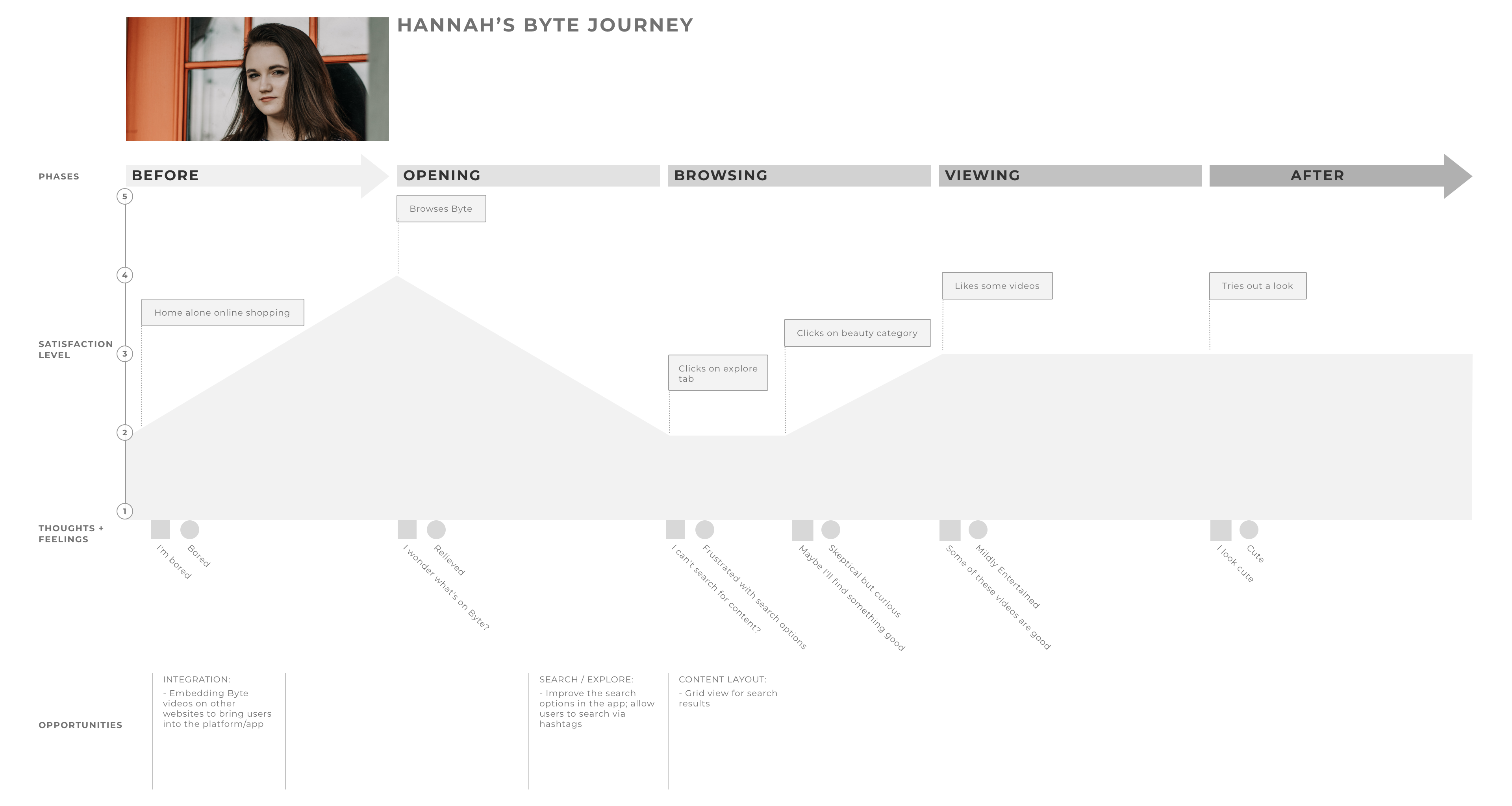
JOURNEY MAPPING AND USER FLOWS
Once our personas were defined, we created journey maps to deepen our understanding users’ thoughts, emotions and actions before, during, and after using Byte, reveal gaps in our understanding, and identify areas of the experience that could be improved.
We chose to map the journey both before and after our features were implemented to compare users’ actions, emotions, and satisfaction level.
Hannah’s Journey Map - Current / Hannah’s Journey Map - Aspirational
Hunter’s Journey Map - Current / Hunter’s Journey Map - Aspirational
Then, we created simplified user flows for Hunter and Hannah based on their journey maps.
FEATURE PRIORITIZATION
As we continued to empathize with our personas and consider the business needs of Byte, our we determined 5 phases of feature rollout to solve users’ issues:
PHASE 1:
Provide users with more information, such as: number of followers, loops, and rebytes with an expanded user profile (users are currently self-reporting these stats) and see more creator content at a glance via a grid layout option (currently, you can only view one video at a time on account pages)
phase 2:
Allow users to discover content via tags (currently, the search tool can only be used to find specific usernames)
phase 3:
Create a new “spotlight” category to help content creators looking to increase their following, and power users who want to discover new content and creators (current categories are redundant and unhelpful)
phase 4:
Separate notifications into sortable categories (likes, rebytes, followers, comments, mentions), and alert users to new notifications with a notification indicator
Phase 5:
Encourage interaction with comment replies
We decided to reserve improved video editing, which would encourage users to use capture and edit videos within Byte, for a later round of feature additions.
Once our features were prioritized and users flows set, we began sketching and creating low-fidelity wireframes to try different approaches to our solutions.
We quickly moved into high-fidelity because we had a solid foundation (Byte’s interface) to work from.
Step Four: IDEATION
- Sketching
- High-Fidelity Wireframes
phase 1: expanded profile information
First we conducted a design studio to rapidly sketch potential profile layouts. However, even at low-fidelity, it was clear that adding information directly to the profile made it feel cluttered and interfered with Byte’s minimal aesthetic.
After brainstorming, we decided to take inspiration from baseball cards, with a picture, name and username on the front, and statistics on the back.


The user’s profile “card” would animate and flip to reveal more information, suggested by the dogeared corner. This solution appealed to both the content creator’s and power user’s desire to display more information, while respecting the need for privacy that characterized our tertiary persona, the casual user who primarily browses for content.

Front

Back
As another upgrade to the profile view, we also developed a grid layout as part of the profile changes for phase one. This grid was also helpful in phase 2 for search results. (Please see below.)
phase 2: Tags
One of the primary complaints of our users was that Byte’s search feature was weak because it only allowed users to search by username, and couldn’t locate content. We therefore expanded Byte’s search option to include user-generated hashtags.

Currently, users can only search by username.

Our design adds tags and categories to the search function.

We created a grid page for search results, making it easy to see multiple videos at a glance instead of one at a time.
phase 3: new spotlight category
We developed the spotlight feature to highlight a different Byte creator each day, and reflect in the creator’s profile card. The spotlight imagery is familiar and direct, to stand apart from the animated cards on the home page, yet avoid overwhelming Byte’s pared-down creator profiles.


phase 4: notification categories
To address the pain point of the confusing notification process, we designed notification category tabs: likes, rebytes, followers, comments, and mentions based on Byte’s design system.

Phase 5: comment replies
To directly engage audiences with creators (and creators with audiences) we designed a comment reply feature. This would enable our power users to participate in discussions with friends and creators.

Step Five:
PROTOTYPE
+ TEST
+ ITERATE
- Usability Testing
- Prototyping (in Invision)
We used an InVision prototype to conduct usability testing with 6 participants. While 4 our of 6 users successfully completed the tasks we gave them, 2 users reported problems with the notification indicator.
“I didn’t know what the lightning bolt was.” —Participant 5
“[I] wouldn’t have known the lightning bolt was a notification button without a prompt. It’s just not a symbol that I’ve seen before.” —Participant 6
iterations: lightning bolt notification indicator


Next Steps
Further iterations of notification indicator: time stamps in notifications; address user confusion with lightning bolt, how to indicate which tab new notifications are in, and how many?
Second round of phasing feature map:
Improve native video editing, so users don’t have to leave Byte to create and edit their content
Privacy settings
Spam filters